
Friday, December 17, 2010
Personal Card
Monday, December 13, 2010
Post Card

I used levels on both of the garden pictures so it would be clearer. Next I used the rectangular marquee tool to select them; I went to edit-free transform to rotate it. Then when it was still selected I clicked refine edge and put radius, smooth on 3 and feather on 6. For the sign I used quick selection tool to select it; and went to hue/saturation to make the color come out. I put hue on 4 and saturation on 15. After that i refined the edge and put smooth on 45; and feather on 16. I made the garden pictures and the sign smaller using free transform; I dragged them over to a 6 by 4 blank tab on photo shop. Once I moved them I put them where I wanted then on the sign layer I used fx to add a drop shadow. For both of the flowers I went to levels; and using the quick selection tool I selected the flowers. Then I went to select-inverse and pressed the delete button on the key board so only my flowers were left. I used refine edge of both. When I was done with that I used free transform then dragged them over.
I made a new layer (Ctrl+J) then went to filter-render-clouds to make the background have clouds. For the sign I put opacity at 90%; and changed the blending mode to luminosity so you could see through the picture. Next I used fx to add a drop shadow to the red flower; I put opacity at 65% For the purple flowers I put opacity at 80%. I added the words in using T-horizontal type tool; I put the font at 18pt on latin-smooth. I used the gradient tool to change the color of the words. On the smaller garden picture I went to fx-drop shadow. On the red flower I went to fx-drop shadow-blending options-bevel and emboss-contour to put on a darker edge. To put the boarder on I made a new layer; and went to select-all then select modify-width 8 pixels.
I went to edit-fill-foreground color to change the color of the boarder. I used the gradient tool on the boarder to make the color half & half. For the words I went to fx-stoke to put in a out line; I put it at 3 pixels. On the bigger garden picture I went to fx and added a drop shadow and put opacity at 69. I think I did a really good job on this picture.
Wednesday, November 17, 2010
Choice 1

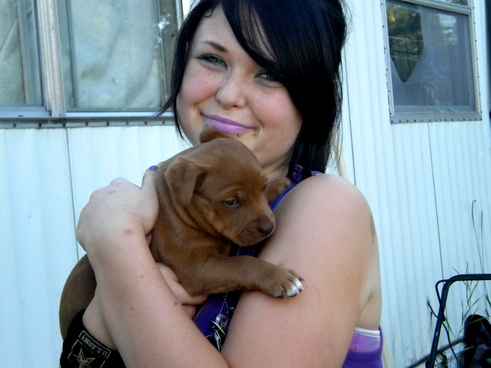
I used the quick selection tool-image-adjustments-replace color to change the tank top from pink to purple.
I also used it to get rid of the dots on the house. I went to levels to make the picture more clear. I think the corrected one looks better because of the puppy.
Friday, November 5, 2010
Scale

This was taken on November 3, 2010 at 8:41pm. I took this picture on party/indoor mode.

First I used the quick selection tool to select the rug. I changed the color to orange using image-adjustments-replace color. I did the same thing with the carpet I changed it to a grayish purple. Next I used the clone stamp tool to remove the blow outs on the marbles. Finally I went to adjustments-brightness/contrast and changed brightness to -21 & contrast to 43. I like the color corrected one best because of what I did with the marbles.
Thursday, November 4, 2010
Cityscape

I took this picture on October 21, 2010 at 1:45pm. This was taken on landscape mode.

Tuesday, November 2, 2010
Archtecture


Diagonal Rule

I took this on close-up mode at 7:45 pm. This picture was taken on October 8, 2010 in front of my house.

I used the patch tool to remove the leaf. Then I used the the spot healing brush to remove the rocks. The healing brush was used to get rid of the lighter sand in the right corner. Next on color balance I changed Cyan, green, and blue, to -5, 25, and 10. Finally I used curves to get rid on the red tint. I think the changed one is better because it has no red tint in it.
Monday, November 1, 2010
Lines

I took this photo on landscape mode at 4:33pm. It was taken on October 10, 2010 by the Popple Bar.

To correct this photo I used the healing brush tool to get rid of the leaves on the trail. Then I levels to fix up the picture. Next I used hue/saturation to make the trail pop out. Hue was on -8 and lightness was on +2. Finally I used color balance on +10 to make the colors of the trees and grass come out. I like the corrected photo best because without the leaves there your not geting disdracted.
Friday, October 29, 2010
Landscapes


I took this sun rise on dusk/dawn mode at 7:10am. It was taken on October 13, 2010. The emphasis in this picture is sky because there is 1/4 of land and 3/4 of sky.

I used the healing brush tool to get rid of the brach because it was distracting. Next the patch tool was used to fix anything in the sky that I missed. I went to adjustments-color balance-midtones. I changed green, blue to +15 and +50. Then I went to curves to make the picture look better. Finally I went to vibrance to change vibrance-saturation to -12 and +23. This picture is much better than the orginal becuase theres no big distracting branch in the way.
Monday, October 25, 2010
Black & White with color

I took this picture at the Baptist Church in Laporte on October 10, 2010. This picture was taken on close-up mode at 5:30.

Then to change the picture from color to black & white I went to Adjustments-Hue/Saturation. I moved the saturation all the way down and thats how I turned black & white.

I used the quick selection tool to select the the flowers. Then I used the eraser tool to make the flowers pop out from the black & white. I picked the flowers that I wanted to change. I went to levels to make the colored flowers pop out. Next I changed the color of the flowers from purple to pink by using Hue/Saturation and moved hue up to +36 to change it to pink. I like the pink flowers best because they pop out from the black & white and its looks natural.
Friday, October 15, 2010
Photo Cleanup

This is a picture of the old jail in Laporte. I took this picture on October 10, 2010 at 5:41. This jail was taken on auto. I picked this photo to clean up because theres graffiti and distractions that could be changed.

To change this jail I used the clone stamp tool to get rid of the graiffi. I also used the clone stamp tool to change the color of the bricks. I tried using the patch tool and the spot healing brush tool; but every time I used the patch tool I couldn't get the bricks even. The spot healing brush tool was not necessary. I changed the color on adjustments-curves-custom and moved them to where I though the jail looked best. I like the jail after the cleanup because its easier to pay attention to the jail and not the graiffi.
Monday, October 11, 2010
Color Replacement

This sunflower taken on October 5, 2010 at 5:30pm; behind my house. I used auto to take this picture.

To get the sunflower to change from yellow to orange I had too use photoshop. First I used the marquee tool to select the flower than I used quick selection tool to select only the flower petals. I went to image-adjustments-replace color and changed the color to orange. I used color balance-midtones; and added cyan +19, mangenta +13, and -3 of yellow. On adjustments-hue/saturation I changed lightness, saturation, hue, and put them at -19, +10, and -7. I think the original sun flower looked better when it was yellow rather than orange.
Wednesday, September 29, 2010
Straight VS Angle


Subscribe to:
Posts (Atom)